前言
开发中,经常会遇到让图片自适应容器大小的场景,有时候图片尺寸和比列是不确定的。若只是简单的把图片的长和高设置为100%,可能会出现图片失真的情况。以下几种方法可实现图片根据容器的大小自适应。

第一种:通过max-width和max-height
将图片的 max-width 和 max-height 设置成100%
1
2
3
4
| .img-box__img1 {
max-width: 100%;
max-height: 100%;
}
|
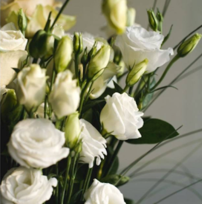
这个方法最为简单,但有一个缺点是,当图片尺寸较小或容器过大时,图片的长边和短边都无法填满容器,如下图所示:
第二种:通过背景图的方式
图片以背景图的形式展示,利用 background-size 属性,将其设置为 contain,在保持图片宽高比的前提下缩放图片,保证把图片扩展至最大尺寸,以使其宽度和高度完全适应内容区域。
1
2
3
4
5
| .img-box__img2 {
width: 100%;
height: 100%;
background: url('https://img11.360buyimg.com/da/s800x800_jfs/t1/114578/23/16885/259767/5f51b88eE470cb092/6edf1a51c836efc3.jpg') no-repeat center/contain;
}
|
backgrount-image 没有任何语义,导致搜索引擎不会识别背景图也不会抓取背景图,不利于搜索引擎优化;且背景图会在页面加载完成之后才开始加载。
_注:图片以背景图形式展示还是以 img 标签形式展示?
- img标签有alt和title等属性,有利于搜索引擎识别图片;若图片想让搜索引擎抓取到,比如广告图、产品图或logo,建议使用img标签;
- 仅作为页面装饰效果的图片,比如小图标之类的,建议使用 backgrount-image
第三种:通过 padding-bottom 的方式
在css中,当padding-top、padding-bottom、margin-top 或 margin-bottom 取值为百分比的时候,参照的是父元素的宽度。
1
2
3
4
5
6
7
| <div class="img-box">
<div class="img-box__inner">
<img
class="img-box__img3"
src="https://img11.360buyimg.com/da/s800x800_jfs/t1/114578/23/16885/259767/5f51b88eE470cb092/6edf1a51c836efc3.jpg" alt="京东房产" />
</div>
</div>
|
1
2
3
4
5
6
7
8
9
10
11
12
13
14
| .img-box__inner {
position: relative;
padding-bottom: 100%;
width: 100%;
height: 0;
overflow: hidden;
}
.img-box__img3 {
position: absolute;
top: 50%;
left: 50%;
transform: translate(-50%, -50%);
width: 100%;
}
|
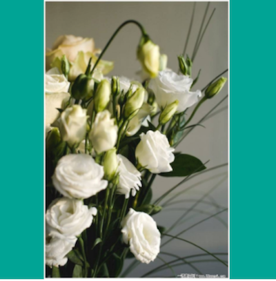
采用 padding-bottom 的方式,当图片的高度过大时,若是容器的高度固定,且设置为 overflow: hidden,图片会被裁剪,如下图所示:
想要实现的效果,其实是:
_注:
对于图片等资源,加载是需要时间的,可以通过 padding-bottom 提前占位,避免图片被撑开的过程中,出现闪烁的现象。
第四种: 利用css3属性 -> object-fit
object-fit 属性指定元素的内容应该如何去适应指定容器的高度与宽度,可适用于img和video标签。设置object-fit: contain,可实现图片保持原有尺寸比例,内容被缩放。
1
2
3
4
5
| .img-box__img4 {
width: 100%;
height: 100%;
object-fit: contain;
}
|
第五种: 通过 js 根据容器的大小重新设置图片的大小
大概思路是,通过 js 分别获取容器与图片的宽和高,算出容器和图片的大小比例,根据比例值,重新设置图片的大小
1
2
3
4
5
6
7
8
9
10
11
12
13
14
15
16
17
18
19
|
var imgBox = document.getElementById('imgBox')
var imgDom = document.getElementById('img5')
var imgBoxWidth = imgBox.offsetWidth
var imgBoxHeight = imgBox.offsetHeight
var img = new Image()
img.src = imgDom.src
img.onload = function () {
var imgWidth = this.width
var imgHeight = this.height
var wRatio = imgBoxWidth / imgWidth
var hRatio = imgBoxHeight / imgHeight
var fitRatio = hRatio < wRatio ? hRatio : wRatio
var w = Math.round(imgWidth * fitRatio)
var h = Math.round(imgHeight * fitRatio)
imgDom.style.width = w + 'px'
imgDom.style.height = h + 'px'
imgDom.style.display = 'block'
}
|
这五种方法的完整代码:
1
2
3
4
5
6
7
8
9
10
11
12
13
14
15
16
17
18
19
20
21
22
23
24
25
26
27
28
29
30
31
32
33
34
35
36
37
38
39
40
41
42
43
44
45
46
47
48
49
50
51
52
53
54
55
56
57
58
59
60
61
62
63
64
65
66
67
68
69
70
71
72
73
74
75
76
77
78
79
80
81
82
83
84
85
86
87
88
89
90
91
92
93
94
95
96
97
98
99
100
101
102
103
104
| <!DOCTYPE html>
<html lang="en">
<head>
<meta charset="UTF-8">
<title>Title</title>
<style>
.img-box {
position: relative;
display: flex;
align-items: center;
justify-content: center;
margin: 20px auto;
width: 400px;
height: 400px;
background-color: #00a495;
overflow: hidden;
}
.img-box__img1 {
  max-width: 100%;
  max-height: 100%;
}
.img-box__img2 {
  width: 100%;
  height: 100%;
  background: url('https://img11.360buyimg.com/da/s800x800_jfs/t1/114578/23/16885/259767/5f51b88eE470cb092/6edf1a51c836efc3.jpg') no-repeat center/contain;
}
.img-box__inner {
position: relative;
padding-bottom: 100%;
width: 100%;
height: 0;
overflow: hidden;
}
.img-box__img3 {
position: absolute;
top: 50%;
left: 50%;
transform: translate(-50%, -50%);
width: 100%;
}
.img-box__img4 {
width: 100%;
height: 100%;
object-fit: contain;
}
.img-box__img5 {
display: none;
}
</style>
</head>
<body>
<div class="img-box">
<img
class="img-box__img1"
src="https://img11.360buyimg.com/da/s800x800_jfs/t1/114578/23/16885/259767/5f51b88eE470cb092/6edf1a51c836efc3.jpg" alt="京东房产" />
</div>
<div class="img-box">
<div class="img-box__img2"></div>
</div>
<div class="img-box">
    <div class="img-box__inner">
      <img
        class="img-box__img3"
        src="https://img11.360buyimg.com/da/s800x800_jfs/t1/114578/23/16885/259767/5f51b88eE470cb092/6edf1a51c836efc3.jpg" alt="京东房产" />
    </div>
</div>
<div class="img-box">
<img
class="img-box__img4"
src="https://img11.360buyimg.com/da/s800x800_jfs/t1/114578/23/16885/259767/5f51b88eE470cb092/6edf1a51c836efc3.jpg" alt="京东房产" />
</div>
<div class="img-box" id="imgBox">
<img
class="img-box__img5"
id="img5"
src="https://img11.360buyimg.com/da/s800x800_jfs/t1/114578/23/16885/259767/5f51b88eE470cb092/6edf1a51c836efc3.jpg" alt="京东房产" />
</div>
</body>
<script type="text/javascript">
var imgBox = document.getElementById('imgBox')
var imgDom = document.getElementById('img5')
var imgBoxWidth = imgBox.offsetWidth
var imgBoxHeight = imgBox.offsetHeight
var img = new Image()
img.src = imgDom.src
img.onload = function () {
var imgWidth = this.width
var imgHeight = this.height
var wRatio = imgBoxWidth / imgWidth
var hRatio = imgBoxHeight / imgHeight
var fitRatio = hRatio < wRatio ? hRatio : wRatio
var w = Math.round(imgWidth * fitRatio)
var h = Math.round(imgHeight * fitRatio)
imgDom.style.width = w + 'px'
imgDom.style.height = h + 'px'
imgDom.style.display = 'block'
}
</script>
</html>
|