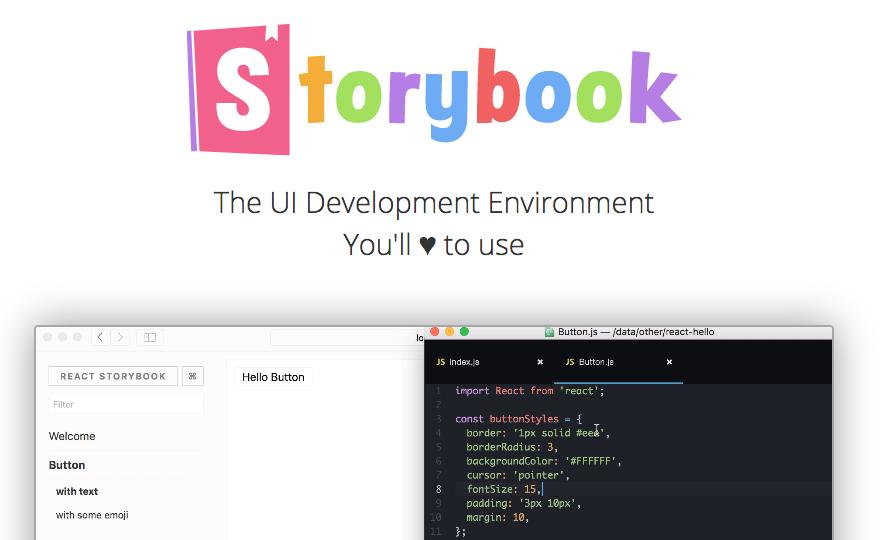
组件库的存在可以大大提高开发效率。但就像盖房子一样,地基先打好,并且可能需要晾晒几天,之后的建筑才能更牢固。今天我就自己按照官方文档搭建的storybook组件库给大家做一个分享。

流程

  1. 创建项目库:
  2. 引入storybook
  3. 配置storybook环境代码及处理报错
  4. 编写组件
  5. 增加Class作用域
  6. 预览组件
  7. 发布组件

创建组件库

  1. 如果你已经有自己的任何一个(React+TS)项目,不用管里面的其他项目文件,这个项目就可以用。但是注意要删除所有的.lock文件。因为在storybook初始化的时候,.lock文件可能会导致安装storybook失败。

  2. 如果没有项目库,你可以自己在空文件夹中执行$ npx create-react-app echo-rui –typescript 命令来创建自己的项目。这里关于React配置TS我就不做介绍了,具体可以参考网上配置。

引入StoryBook

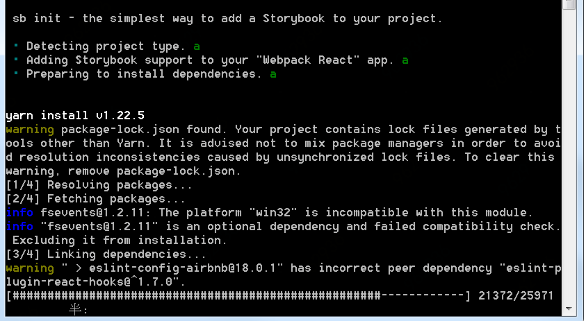
在已有项目命令行执行$ npx sb init 此操作命令根据你当前的package.json文件自动配置需要的storybook环境,包括适配TS的一些配置。安装大概需要3分钟。安装完成后,就可以看到命令行窗口提示:

1
npm run storybook

来预览效果

配置storybook环境代码及处理报错

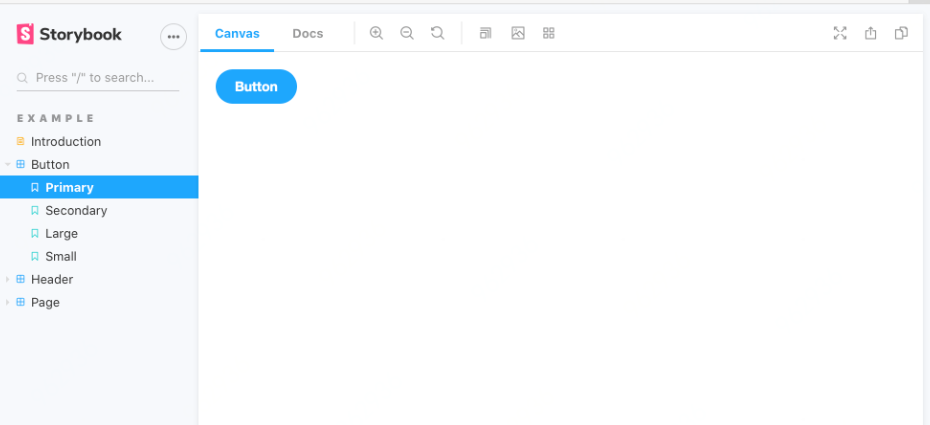
运行的预览效果是在init的时候,会在src/stories下面生成3个demo组件,Button、Page、Header
运行时可能会报错的消息:

1
loose must be same ...

解决办法:将babel.config中加入‘loose: true’

1
2
3
4
5
6
7
8
9
10
11
12
13
14
15
16
17
18
19
20
21
22
23
24
25
26
27
28
29
30
31
32
33
34
35
36
37
38
39
module.exports = {
"presets": [
[
"@babel/preset-env",
{
"loose": true,
"corejs": "3", // 声明 corejs 版本
"useBuiltIns": "usage"
}
],
"@babel/preset-react"
],
"plugins": [
"react-hot-loader/babel",
"@babel/plugin-proposal-object-rest-spread",
"@babel/plugin-transform-runtime",
[
"@babel/plugin-proposal-class-properties",
{
"loose": true
}
], // 支持类属性写法
["@babel/plugin-proposal-decorators", { "legacy": true }], // 支持装饰器语法
[
'react-css-modules',
{
generateScopedName: '[local]___[hash:base64:5]',
exclude: 'node_modules',
filetypes: {
'.scss': {
syntax: 'postcss-scss',
// plugins: ['postcss-nested']
}
}
}
]

]
}

解决报错信息后,重新运行

1
npm run storybook

命令,预览页面,可以看到页面在本地6006端口(默认配置)运行

此时生成的demo组件类型是根据项目环境生产的,即如果你配置了TS环境,生成的文件类型就是.tsx否则就是.js文件

编写组件

  1. 在src下创建components文件夹,将组件分类放在components/下,组件使用.tsx后缀。本项目使用了scss文件。
  2. 可以自己直接本地编辑一个简单组件或者从之前的项目中直接拷贝一个TS组件。
  3. 如果想要预览效果,此时就需要书写components/mycomponent/ mycomponent.stories.tsx文件。
    书写格式及具体内容可以参考项目初始化的时候,生成的demo文件。
1
2
3
4
5
6
7
8
9
10
11
12
13
14
15
16
17
18
19
20
21
22
23
24
25
26
27
28
29
30
31
32
33
34
35
36
37
38
39
40

import React from 'react';
// also exported from '@storybook/react' if you can deal with breaking changes in 6.1
import { Story, Meta } from '@storybook/react/types-6-0';

import { Button, ButtonProps } from './Button';

export default {
title: 'Example/Button',
component: Button,
argTypes: {
backgroundColor: { control: 'color' },
},
} as Meta;

const Template: Story<ButtonProps> = (args) => <Button {...args} />;

export const Primary = Template.bind({});
Primary.args = {
primary: true,
label: 'Button',
};

export const Secondary = Template.bind({});
Secondary.args = {
label: 'Button',
};

export const Large = Template.bind({});
Large.args = {
size: 'large',
label: 'Button',
};

export const Small = Template.bind({});
Small.args = {
size: 'small',
label: 'Button',
};

.stories.tsx文件相当于一个单独的页面,所以需要给其配置Meta标签,并且设置title,component即当前组件,通过import方式引入。

Story使用其渲染功能(Canvas)将args绑定在渲染模板上,即可实现切换按钮展示不同组件模式功能。
.stories.tsx文件是支持在storybook中预览的文件(作用是本地预览)其实和使用组件没有什么关系。具体storybook的预览原理请参考我的另一篇博客****

增加样式作用域

  • 我们书写的组件,如果两个组件的class一样的话,样式就会被污染覆盖。解决这个问题,需要配置css-modules给样式增加哈希值,具体配置如下:
    1. babel.config.js中
1
2
3
4
5
6
7
8
9
10
11
12
13
14
15
16
17
18
19
20
21
22
23
24
25
26
"plugins": [
"react-hot-loader/babel",
"@babel/plugin-proposal-object-rest-spread",
"@babel/plugin-transform-runtime",
[
"@babel/plugin-proposal-class-properties",
{
"loose": true
}
], // 支持类属性写法
["@babel/plugin-proposal-decorators", { "legacy": true }], // 支持装饰器语法
[
'react-css-modules',
{
generateScopedName: '[local]___[hash:base64:5]',
exclude: 'node_modules',
filetypes: {
'.scss': {
syntax: 'postcss-scss',
// plugins: ['postcss-nested']
}
}
}
]

]
    1. 在.storybook/webpack.config.js中配置
      1
      2
      3
      4
      5
      6
      7
      8
      9
      10
      11
      12
      13
      14
      15
      16
      17
      18
      19
      20
      21
      22
      23
      24
      25
      26
      27
      28
      29
      30
      31
      32
      33
      34
      35
      36
      37
      38
      39
      40
      41
      42
      43
      44
      45
      46
      47
      48
      49
      50
      51
      52
      53
      54
      55
      56
      rules: [
      {
      test: /\.(mjs|jsx?)$/,
      use: [
      {
      loader: require.resolve('babel-loader'),
      options: {
      cacheDirectory: path.join(
      appDirectory,
      '/node_modules/.cache/storybook'
      ),
      babelrc: false,
      plugins: [
      [
      require.resolve('babel-plugin-react-docgen'),
      {
      DOC_GEN_COLLECTION_NAME: 'STORYBOOK_REACT_CLASSES'
      }
      ]
      ]
      }
      }
      ],
      include: [appDirectory],
      exclude: [path.join(appDirectory, '/node_modules')]
      },
      {
      test: /\.(ts|tsx)$/,
      loader: require.resolve('ts-loader')
      },
      {
      test: /\.md$/,
      use: [
      {
      loader: require.resolve('raw-loader')
      }
      ]
      },
      {
      test: /\.(s*)css$/,
      sideEffects: true,
      use: [
      require.resolve('style-loader'),
      {
      loader: require.resolve('css-loader'),
      options: {
      importLoaders: 1,
      modules: {
      localIdentName: '[local]___[hash:base64:5]'
      }
      }
      }
      ]
      }
      ]

    1. 注意:Typescript中使用css-modules解析css,需要使用className={style.class}才能正确解析.ts文件中的类,并且加上哈希值。

预览组件

  • 执行
1
npm run storybook 

就可以看到组件运行的样子。恭喜你,已经拥有一个自己写的组件并且可以本地预览效果了。之后其他成员想看组件效果,可以直接在这个组件库下面执行预览命令。

发布

  • 发布到npm之前需要先完善一下README.md文档。同时,根目录下创建一个.npmignore文件。登录自己的npm账号,最后执行npm publish ,发布即可