大家好,今天我们来谈谈前端每个人都在写的东西,组件。
在当下react和vue这么流行的大环境下,相信你一定写过组件。如果你感觉你是职场小白,只从github或者npm下载过一些组件使用,自己没有写过,那么你就错了,你一定写过。因为往大一点说,一个页面可以是一个组件,往小了说,一个按钮也是一个组件,你写的区别只在于它的扩展性是不是好,通用性是不是强。所以,首先不要畏惧,我们每个人其实都在写组件,今天的分享,就是如何让我们更好的写组件
一、需求分析-构思组件
从接手项目,带你开启组件封装第一步:
1. 需求分析
拿到项目之后,这里以一个新项目为例,首先,全局概览。看一下这个页面总共分几部分。各个部分之间有什么相同之处,这里举例(边距:考虑封装一个共有的盒子、色系:考虑用父元素继承的方式获取、title、排列方式、图文规划、功能区块等);初步划分功能,列出几个可能要封装的组件。
2. 综合考虑
联系其他页面,再次分类,调整组件的分类,尽可能做到组件公用,扩张组件的可配置项(例如,title文案前可能有icon图标,尾部可能有更多箭头,文案等,尽可能完善这个组件)。
3. 归置组件
综合页面需求及过往经验,将组件划分为基础组件和业务组件。
针对不同类型组件,有不同的封装要求。公共类组件,可配置项一定要多,即要活,放哪里都可以用。业务类组件,可以适当地写死一些东西,因为确定这个组件是轻易不会变动的,例如(流程说明、提示楼层、价格楼层等)
4. 使用说明
封装好的组件,最好有使用说明,有使用demo最好,使小白只要粘贴代码,就可以跑起来,首先增加使用者的自信心,可以轻易看到组件(默认样式及功能可以展示与使用)。
二、组件封装要求
组件封装,需要有一些强制的要求,才能保证我们的组件库在日益壮大的同时,不会因为各种不统一和零散化,导致组件库越来越难维护。
1. 关于组件规模
- 基础组件:被拆解的很零散的组件;例如一个按钮、一个input框、一个title、一个盒子
一般而言,一些基础的、使用频率比较高的组件,适合做成‘零散型’组件,即一个小的单位,例如,一个toast,一个input,一个btn一个置顶按钮等。但是越是‘零散’的组件,其可配置项越要灵活,功能性越要完善;包括样式、入参等。
优点:可使用范围广,通用性、扩展性强。
缺点:组件很小,只能局部使用,需要和页面其他元素联动使用。
- 模块组件:归整的很完善的组件;例如一个完整的轮播图、一个完整的筛选项、一个分页list。
相对于基础组件,为了更高效的开发,我们有时候会把业务性比较强,功能比较统一的一些‘大型模块’封装为一个组件。例如整个筛选功能,整个分页加载。整个图文混排等‘模块’,封装为一个组件。
优点:组件功能完善,不需要组装配合,直接可以构建成完整的页面,开发效率高。
缺点:业务定制化程度高,相对来说,可配置项少。
2. 关于class命名
语义化
命名一定要语义化,让使用的人看到类名,就知道这个是组件的那个元素。(例如title_icon title_more_btn)
禁止使用中文拼写,要求英文翻译。风格统一
同一个组件,命名一定要风格一致。(下划线、短横杠、驼峰式)业务分类
业务性强的组件,class命名的时候paimai_button_small功能分类
组件公用性强的,使用公用class命名,例如confim_submit_button
3. 关于样式书写
百分比
内部样式用100%来处理,外部套一个父盒子,父盒子的宽高使用传入样式作用域
样式书写最好使用父套子的方式,给类名加权重和作用域,以保证绝对的样式‘内部性’。容错
样式也要有容错,不能差几像素,就乱了,这里指用flex布局,不要写死宽高。禁忌写死
样式避免使用!important写死样式。范围
必要时使用最大限制max或者min,防止外部没有定义,宽高超出组件内部。托底
书写托底的默认样式,且风格保持一致。
我们定义页面一级父盒子,padding的留白统一为25像素。语言
建议统一使用scss书写,虽然目前组件库内部webpack配置会处理好几种css语言,但是,为统一代码,目前建议使用scss。
4. 关于mock数据结构
大众化
数据结构大众化。即数据类型符合一般渲染逻辑;例如:轮播图使用数组结构、基本信息使用对象、图片地址使用字符串等容错处理
内部数据结构要紧凑、稳固,接收外部传入参数时,做各种格式化处理,此处包括(托底,容错,类型判断,防止因外部输入格式不对导致组件内部报错)。
例如:入参是数组的要求,就需要判断来源数据类型,不是数组的,格式化为数组,不可以格式化的,直接走托底。可扩展
为后续组件扩展留余地,不把数据结构写的太死。例如二位数组处理,数据分组格式化等。
5. 关于变量参数
语义化
例如:size,表示组件的大小)
多参
只供组件内部使用的变量,可以内部定义。尽可能多的由外部传入参数,因为这样可以尽可能的做到可配置。托底值
不管是内部定义参数,还是外部传参都必须有默认值,即托底逻辑处理,不要存在必传参数,必要时做提示处理。
6. 关于方法暴露
内部方法暴露
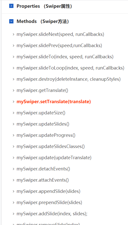
尽可能多的暴露方法,关于内部的一些方法定义,如果可以使组件更具灵活性,可以考虑将内部方法暴露出来。例如:功能强大的swiper组件,就暴露了很多内部定义的方法,供用户灵活的定制自己的组件。业务逻辑不要有
在方法中,一切业务逻辑不要有,尽可能的、可配置的透传参数,以便父级元素做数据处理。命名
方法名称命名标准:
点击事件 **Click
格式化方法 **Format
初始化方法 **Init
方法名称不怕长,就怕看不懂功能,分不清你我
三、示例解析
1.放大镜组件(vue)

- 组件内部代码
1 | <template> |
- 组件变量定义
1 | export default { |
- 组件样式书写
1 |
|
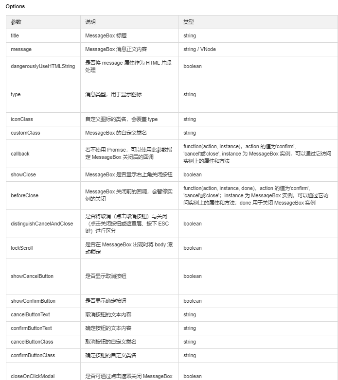
2.消息框组件(eleemnt-ui)
- 组件Dom
1 | <template> |
- 组件变量定义
1 | props: { |
- 组件样式书写参考
1 | .el-message-box{ |
总结
相信任何一个好的组件,都是经过实践历练,调试出来的,开始封装的组件没有那么多功能,没有那么完善不要灰心,坚持用,不好的地方我们可以在使用中改,经过多次使用的组件,一定会慢慢丰富和强健起来。最终可能经过3,5年时间,我们做的的组件库,可以达到项目的70%利用率,同时,我们的开发效率也会大大提高。代码更强健。
最后,本文档作为前端组件基本标准,我们会越来越细化它的要求。希望大家一起献计献策,完善我们的组件封装标准。