传统的实现方式
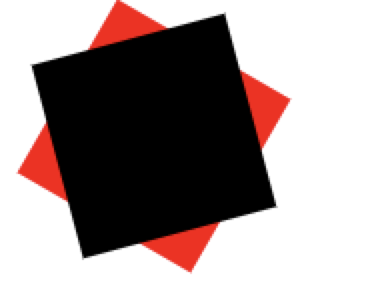
三角形
1
2
3
4
5
6
7
8
9
10
| <div class="div"></div>
.div {
width: 0;
height: 0;
border-left: 5px solid transparent;
border-right: 5px solid transparent;
border-bottom: 10px solid red;
}
|
使用透明的border模拟出三角形
切角
1
2
3
4
5
6
7
8
9
10
11
| <div class="div"></div>
.div {
width: 40px;
height: 40px;
padding: 40px;
background: linear-gradient(135deg, transparent 15px, red 0) top left;
background-size: 50% 50%;
background-repeat: no-repeat;
}
|
通过角度和透明配合,使用线性渐变实现切角。
梯形
- 利用伪元素加旋转透视实现梯形
1
2
3
4
5
6
7
8
9
10
11
12
13
14
15
16
17
18
19
| <div class="div"></div>
.div {
position: relative;
width: 60px;
padding: 60px;
}
.div::before {
content: '';
position: absolute;
top: 0;
left: 0;
right: 0;
bottom: 0;
transform: perspective(20px) scaleY(1.3) rotateX(5deg);
transform-origin: bottom;
background: yellowgreen;
}
|
perspective 属性设置镜头到元素平面的距离。perspective 一定要在 rotateY(或 rotateX)的前面
transform-origin 规定了镜头在平面上的位置。默认是放在元素的中心
- 利用border在矩形两侧构造两个透明的三角形
1
2
3
4
5
6
7
8
9
10
| <div class="div"></div>
.div {
position: relative;
width: 60px;
border-bottom: 60px solid red;
border-left: 40px solid transparent;
border-right: 30px solid transparent;
}
|
五边形
1
2
3
4
5
6
7
8
9
10
11
12
13
14
15
16
17
18
19
| <div class="div"></div>
.div {
position: relative;
width: 60px;
border-bottom: 60px solid red;
border-left: 40px solid transparent;
border-right: 40px solid transparent;
}
.div::before {
content: '';
position: absolute;
top: 60px;
left: -40px;
border-top: 60px solid black;
border-left: 70px solid transparent;
border-right: 70px solid transparent;
}
|
五边形 = 梯形 + 三角形
六边形
1
2
3
4
5
6
7
8
9
10
11
12
13
14
15
16
17
18
19
| <div class="div"></div>
.div {
position: relative;
width: 60px;
border-bottom: 60px solid red;
border-left: 40px solid transparent;
border-right: 40px solid transparent;
}
.div::before {
content: '';
position: absolute;
top: 60px;
left: -40px;
width: 60px;
border-top: 60px solid black;
border-left: 40px solid transparent;
border-right: 40px solid transparent;
}
|
六边形 = 梯形 + 梯形

八边形
1
2
3
4
5
6
7
8
9
10
11
12
13
14
15
16
17
18
19
20
21
22
23
24
25
26
27
28
29
30
| <div class="div"></div>
.div {
position: relative;
width: 40px;
height: 100px;
margin: 0 auto;
background-color: green;
}
.div::before {
content: '';
height: 60px;
position: absolute;
top: 0;
left: 40px;
border-left: 30px solid black;
border-top: 20px solid transparent;
border-bottom: 20px solid transparent;
}
.div::after {
content: '';
position: absolute;
height: 60px;
top: 0;
left: -30px;
border-right: 30px solid red;
border-top: 20px solid transparent;
border-bottom: 20px solid transparent;
}
|
八边形 = 梯形 + 矩形 + 梯形
五角星
1
2
3
4
5
6
7
8
9
10
11
12
13
14
15
16
17
18
19
20
21
22
23
24
25
26
27
28
29
30
31
32
| <div class="div"></div>
.div {
margin: 50px 0;
position: relative;
width: 0;
border-right: 100px solid transparent;
border-bottom: 70px solid red;
border-left: 100px solid transparent;
transform: rotate(35deg) scale(.6);
}
.div::before {
content: '';
position: absolute;
border-bottom: 80px solid black;
border-left: 30px solid transparent;
border-right: 30px solid transparent;
top: -45px;
left: -65px;
transform: rotate(-35deg);
}
.div::after {
content: '';
position: absolute;
top: 3px;
left: -105px;
border-right: 100px solid transparent;
border-bottom: 70px solid green;
border-left: 100px solid transparent;
transform: rotate(-70deg);
}
|
3个三角形叠加旋转在一起实现
六角星
1
2
3
4
5
6
7
8
9
10
11
12
13
14
15
16
17
18
19
| <div class="div"></div>
.div {
position: relative;
width: 0;
border-left: 50px solid transparent;
border-right: 50px solid transparent;
border-bottom: 100px solid red;
}
.div::after {
content: '';
position: absolute;
border-left: 50px solid transparent;
border-right: 50px solid transparent;
border-top: 100px solid black;
top: 30px;
left: -50px;
}
|
一个向上的三角形 ▲,叠加上一个向下的三角形 ▼,就可以得到一个六边形
八角星
1
2
3
4
5
6
7
8
9
10
11
12
13
14
15
16
17
18
19
20
| <div class="div"></div>
.div {
position: relative;
width: 100px;
height: 100px;
background-color: red;
transform: rotate(30deg);
}
.div::before {
content: '';
position: absolute;
top: 0;
left: 0;
width: 100px;
height: 100px;
transform: rotate(45deg);
background-color: black;
}
|
使用两个矩形进行旋转拼接
十二角星
1
2
3
4
5
6
7
8
9
10
11
12
13
14
15
16
17
18
19
20
21
22
23
24
25
26
27
28
29
30
31
| .div {
position: relative;
margin: 40px;
width: 100px;
height: 100px;
margin-bottom: 100px !important;
background-color: red;
transform: rotate(30deg);
}
.div::before {
content: "";
position: absolute;
top: 0;
left: 0;
width: 100px;
height: 100px;
transform: rotate(30deg);
background-color: black;
}
.div::after {
content: "";
position: absolute;
top: 0;
left: 0;
width: 100px;
height: 100px;
transform: rotate(60deg);
background-color: green;
}
|
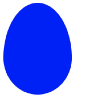
椭圆
1
2
3
4
5
6
| .div {
width: 120px;
height: 160px;
background-color: blue;
border-radius: 50% 50% 50% 50% / 60% 60% 40% 40%;
}
|
CSS Shapes
clip-path
CSS 新属性 clip-path,意味裁剪路径的意思,让我们可以很便捷的生成各种几何图形。clip-path 通过定义特殊的路径,实现我们想要的图形。而这个路径,正是 SVG 中的 path 。看看它的 API:
1
2
3
4
5
6
7
8
9
10
11
12
13
14
15
16
17
18
19
20
21
22
23
24
25
26
27
28
29
| {
clip-path: none;
clip-path: url(resources.svg#c1);
clip-path: inset(100px 50px);
clip-path: circle(50px at 0 100px);
clip-path: polygon(50% 0%, 100% 50%, 50% 100%, 0% 50%);
clip-path: padding-box circle(50px at 0 100px);
clip-path: inherit;
clip-path: initial;
clip-path: unset;
}
|
- clip-path: circle(50px at 50px 50px) 表示在元素的 (50px, 50px)处,裁剪生成一个半径为 50px 的圆。
以元素的左上角为坐标起点
clip-path生成圆
1
2
3
4
5
6
| .div {
width: 100px;
height: 100px;
background-color: royalblue;
clip-path: circle(50px at 50px 50px)
}
|
clip-path生成十边形
1
2
3
4
5
6
| .div {
width: 100px;
height: 100px;
background-color: royalblue;
clip-path: polygon(50% 0%, 80% 10%, 100% 35%, 100% 70%, 80% 90%, 50% 100%, 20% 90%, 0% 70%, 0% 35%, 20% 10%)
}
|
整个 clip-path 属性,最为重要的当属 polygon,可以利用 polygon 生成任意多边形。本例中依次列出了10个坐标点,可以采用百分比,也可以是具体数值。
clip-path动画
clip-path 另外一个强大之处在于可以进行 CSS transtion 与 CSS animation,也就是过渡和动画。
看一个多边形的过渡切换动画。
多边形过渡动画
图形变换动画
除此之外,我们还可以尝试,将一个完整的图形,分割成多个小图形,这也是 clip-path 的魅力所在,纯 CSS 的图形变换:
Clip-path triangle2rect
clip-path 动画的局限
clip-path 动画虽然美好,但是存在一定的局限性,那就是进行过渡的两个状态,坐标顶点的数量必须一致。
也就是如果我希望从三角形过渡到矩形。假设三角形和矩形的 clip-path 分别为:
- 三角形:clip-path: polygon(50% 0, 0 100%, 100% 0)
- 矩形:clip-path: polygon(0 0, 100% 0, 100% 100%, 0 100%)
进行过渡动画时候,直接从 polygon(50% 0, 0 100%, 100% 0) –> polygon(0 0, 100% 0, 100% 100%, 0 100%) 是不行的,因为是从 3 个坐标点变换到 4 个坐标点。
因此这里需要使用一个讨巧的办法,在三角形的表示方法中,使用四个坐标点表示,其中两个坐标点进行重合即可。也就是:
- 三角形:clip-path: polygon(50% 0, 0 100%, 100% 0) -> clip-path: polygon(50% 0, 50% 0, 0 100%, 100% 0)
N边形过渡动画
随机生成 N(N>=1000)边形,进行变换,会是什么效果呢?
2000边形过渡动画
变换的瞬间很有爆炸的感觉。不过这里有个很大的问题,只是随机生成了 2000 个坐标点,然后使用 clip-path 将这些坐标点连接起来,并不是符合要求的多边形。
在 VUE官网,有下面这样一个例子,一个规则的多边形进行不断的过渡动画,非常酷炫:
使用 CSS clip-path 实现:
clip-path N polygon
shape-outside
只能和浮动 float 一起使用,它赋予了我们一种更为自由的图文混排的能力。
API
1
2
3
4
5
6
7
8
9
10
11
12
13
14
15
16
17
18
19
20
21
22
23
24
25
| {
shape-outside: none;
shape-outside: margin-box;
shape-outside: content-box;
shape-outside: border-box;
shape-outside: padding-box;
shape-outside: circle();
shape-outside: ellipse();
shape-outside: inset(10px 10px 10px 10px);
shape-outside: polygon(10px 10px, 20px 20px, 30px 30px);
shape-outside: url(image.png);
shape-outside: linear-gradient(45deg, rgba(255, 255, 255, 0) 150px, red 150px);
shape-outside: initial;
shape-outside: inherit;
shape-outside: unset;
}
|
示例
1
2
3
4
5
6
| <div class="container">
<div class="shape-outside">
<img src="image.png">
</div>
xxxxxxxxxxx,文字描述,xxxxxxxxx
</div>
|
1
2
3
4
5
6
| .shape-outside {
width: 160px;
height: 160px;
shape-outside: circle(80px at 80px 80px);
float: left;
}
|
上面 .shape-outside 使用了浮动,并且定义了 shape-outside: circle(80px at 80px 80px) ,表示在元素的 (80px, 80px) 坐标处,生成一个 80px 半径的圆。
嗯?好像没什么了不起啊?这不就是 float 的效果吗?
不,不是的,看看 float 和 加上shape-outside 后的对比:
图文混排 shape-outside
shape-outside 的本质
所以,shape-outside 的本质其实是生成几何图形,并且裁剪掉其几何图形之外周围的区域,让文字能排列在这些被裁剪区域之内。
平行四边形混排
参考示例-平行四边形混排
心形、菱形混排
参考示例-心形、菱形混排
截止到今天, clip-path 与 shape-outside 都有着非常不错的兼容支持。在移动端和非 IE 浏览器下都可以放心的使用
参考资料
原文地址
CSS Shapes(CSS 几何图形)